Bootstrap project continued
Today I worked out how to make the icons look more like the site I am trying to copy, making them overlap the boxes below then with a margin between. The ‘margin’ is actually a thick border on the background circles the same colour as the overall site background (white) and the position is relative to the original.
So this is the styling so far:
   .iconformat {
      padding-top:0.6em;
      font-size:300%;
      background-color:#306F8E;
      color: white;
      text-align: center;
      height: 3em;
      width: 3em;
      border-radius: 1.5em;
      border:0.4em solid white;
      position: relative;
      top: -1.75em;

   }
I am trying to only use em for sizes because that seems from what I am reading to be better for responsive design. Certainly using pixels doesn’t then scale well.
I’ve also added two footer rows as sections and given then background colours, holding them in .container-fluid so that they stretch right to the edge. But so far I haven’t got the boxes in any of the positions ‘right’ and am thinking that maybe they should be panels and I should put some content in them to make it better to see what is happening. Certainly the title of each box is not in a nice position.
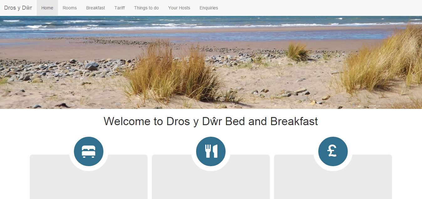
Being super picky with design, I have made each box have a separation by adding a border also the colour of the background (white). However it needs to be the same thickness as the border around the icons (or rather half the thickness to make it equal to the thickness when two are together). But I can’t make proper sense of it as the icon border is 0.4em and the box border is 0.5em yet the space between the boxes is less than the border around the icons, when I would think it should be greater (1em). So is the absolute size of the em eing magnified by the font size of the icons being 300%? In other words the icon border is 3×0.4em=1.2em compared to the space between the boxes being 2×0.5em=1em. The simple test is to change the box border to 0.6em and see if that looks better. Actually to my eye the box border of 0.7em looks better.

Things that are now on my mind:
- How to separate colours out into a palette in CSS, (colour 1, colour2 etc) so that these can simply be specified once and then all things with that class change? But I am not sure I can make that work completely – will have to look for some examples.
- Want to look at panels in more details and decide whether they are needed
- Want to make a carousel slider work on the top particularly to also have text over the top of the images.
- How to make the icons move on hover – which will involve some jquery



Recent Comments